Introduction
First impressions matter, especially in the world of public speaking. Your website is often the first place potential clients will land when researching you, so it is essentially your first meeting point. A professional, well-designed website is crucial for establishing credibility and showcasing your expertise as a speaker and as someone with a message worth sharing. It serves as a powerful marketing tool and a key component of your personal brand.
In this article, we’ll explore some standout public speaker websites, many of whom are close friends to The Speaker Lab team, and we’ll analyze the essential elements that make these websites effective. By looking through and studying these established speakers’ well-designed websites, you’ll gain insights into how to create or improve your own speaker website. You’ll learn how to present yourself in the best light to attract and secure speaking engagements. Your website should introduce you to the public in the best possible way as a professional speaker. Let’s get started!
Key Elements of an Effective Professional Speaker Website
A top, effective public speaker website needs several key parts. It needs to have clear, targeted messaging of your personal brand; your website should describe concisely, yet comprehensively what exactly you speak on and who you target; it should of course have a clean, professional design that catches the eye without distracting too much from the content of the site; and you need to have features that really establish your digital footprint. Let’s start with your messaging.
Clear and Targeted Messaging
First things first, a good professional speaker website should be easy to understand and maneuver. Many website owners, whether speakers or whomever else, hurt themselves by creating a website that is cluttered and confusing. Too much information will, more than likely, scare away visitors to your website. Even worse, busy decision makers and event planners are never looking for extra work. They want to click on your home page (which may very well be the only page on your site when you get started, and that’s fine – more on that later) and pretty much immediately have a clear sense of your brand, message, and style. If they can’t figure that out quickly, they’ll probably move on to the next candidate.
“Shouldn’t my website attract my potential audience members – you know, the people I actually speak to?” Well, not exactly. Remember, your audience members aren’t the people who hire you to speak. Therefore, your website should cater to and be designed for decision makers. Be sure to include a clear, strong value proposition on your website and make it unique with your personal branding – in other words, if your site looks like your competitor’s site, how does that help you stand out?
Another important way to keep your website targeted and on-brand is to have an engaging bio. Your bio should have an abridged version of you personal story tailored to decision makers. Don’t tell them your whole life, but whatever part of your personal story and background helps you stand out as a relevant, unique speaker in your niche should be included in your bio and made easy for website visitors to find. Your website is the digital face of your brand – market yourself well.
Comprehensive and Focused Content on What Exactly You Offer
Okay, so now that we’ve established that your brand, clearly stated, should be the first thing that visitors notice on your website, let’s get into the more specific points you should feature on your site.
Emphasize Your Niche
As a public speaker, you have to find a niche that you fit into. Nobody has a message that will really resonate with every audience. You have to find your target audience. And that necessarily means that decision makers and event planners look for speakers within their own niches. Someone who is organizing a conference for a plumbers’ association is probably not going to spend much time perusing the website of a speaker who primarily speaks to young, up-and-coming therapists, right? That’s just not the same niche – at all. (We realize plumbers have as much need for good therapy as anyone else but you get my point.)
What Services Do You Offer?
Your website needs to include details on your speaking topics and exactly what services you offer. Do you mainly just do big keynotes? Do you speak at company trainings? Do you run workshops? What exactly do you offer in your niche? This is a good section to also include testimonials from both clients and audience members. Put little blurbs on your site that show the experience that you’ve provided in your clients’ words. That is a great way to show that you have had success in your field.
Include case studies, if you have them, that can show the actual effects your talks have had on people. Have audience members left your talks and changed their behavior or business strategies or career path after hearing you speak? Decision makers love to see this kind of stuff.
Demo Video or Speaker Reel
Finally, include a demo video! Include your speaker reel! A quick highlight reel, SportsCenter Top 10 video of your speaking that shows your message, your brand, your style, and your demeanor is the easiest way for decision makers to get a sense of what they can expect from you on stage. Put this as close to the top of your home page as possible.
Professional and Sharp Design
Now, your website can have all the perfect information and clearly state who you are, what your message is, and how your brand fits superbly in your chosen niche, but if it’s plain or disorganized or lazily-designed, then you are definitely losing potential gigs and connections. It is super important that your professional speaker website is visually appealing and has a user-friendly interface.
Consistent branding and color schemes are a must – without them, websites can easily get confusing to look through. And sure, not every is a graphic designer and not everyone has a big budget for a website but that doesn’t mean your site can’t look good and clean. WordPress and Squarespace (and others) have plenty of really nice-looking and affordable themes that you can start with.
Engagement Tools and Contact Information
Finally, your website is your brand’s digital footprint, so you want that footprint to be as large as possible. This means you want your site to be one of the first results that decision makers see when they do a Google search for their events. I mean, come on, how often do you really scroll past the first eight or ten Google results before either changing your search or giving up? This means that you need to have some basic understanding and focus on search-engine optimization (SEO).
Having a blog section on your site with blogs written by you or guest writers that address and answer different questions in your niche that your audience members might ask is a good way to get your site showing up in search engines’ results. Besides SEO results, writing blog posts also helps establish you as a credible, reliable expert in your field. If your brand is helping answer people’s questions, they are more likely to trust your opinion on other issues in the niche.
Multimedia elements such as videos, photo galleries, and podcasts are also great things to include on your website that will help you reach a wider audience. Don’t limit your brand to your on-stage appearances and your website. Get yourself out there and use your website to broaden your impact.
Finally, be sure to include a clear call-to-action that aligns with your brand and message. Also have contact details and forms that are easy to access and submit for anyone who visits your website. I mean, what good is a perfect website if an event planner can’t actually contact you?
Visual Consistency
The best public speaker websites have consistent design. Visual consistency helps establish brand identity by reinforcing your brand’s look and feel. It makes you easily recognizable to potential clients. It also creates a polished and professional appearance and builds credibility and trust with your audience.
Beyond just looking good, a speaking website should provide a seamless and cohesive experience your your visitors. Make sure your own site is easy to navigate and understand. Your core message and values must be consistently communicated.
A consistent design keeps your visitors on your own website for longer. If you have features that encourage interaction with your content, like videos or polls or calls to action, even better.
Top Public Speaker Website Examples
Erick Rheam – Speaker, Author, and Facilitator at The Speaker Lab
What makes this website good?
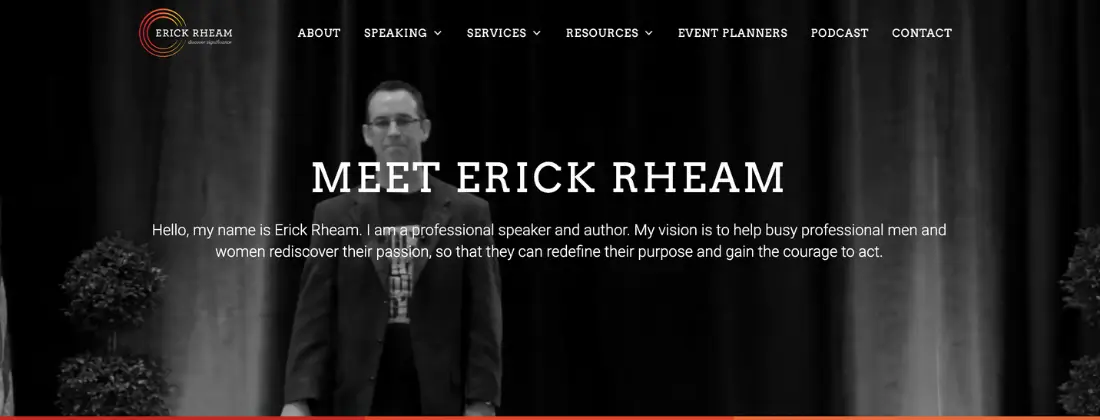
This shows Erick’s landing page. The design is simple, clear, and easy-to-read. Erick’s brand and message is prevalent – “My vision is to help busy professional men and women rediscover their passion” – and immediately communicates what he is all about.
Behind the text is a video background that gives snippets of him speaking which shows his on-stage presence and style. There are clearly marked tabs in his site’s heading that you can use to find out more details on his work, his services, his background, and other resources. He even has a tab specifically for event planners! That is a super feature to include if your site, like Erick’s, is more than just a home page.
Gary Vaynerchuk – Businessman, Author, Speaker, and Internet Personality
What makes this website good?
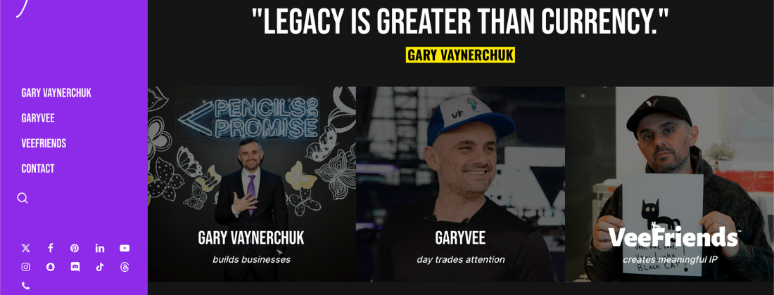
Gary Vaynerchuk’s website is pretty simple for such an established speaker. No youtube videos, no pop up window, no cheat sheet. But that doesn’t take away from his credibility or his clear calls to action. Gary is a thought leader in business and his public speaking website shows that. As you can see from the image above, Gary’s speaking business is comprised of three main parts: his personal brand, Garyvee, his day trading coaching, and VeeFriends, his entertainment company. He has that advertised centrally and on his side panel, clearly indicating that those are his main resources and the key takeaway from his speaking website.
Gary is also very active on social media and that is clearly indicated by the prevalence of his (many) social media links on the sidebar. Gary understands personal branding and uses it well to promote his coaching programs and live events.
Matt Matkovich – Ultramarathon Runner, Accredited School Counselor, and Motivational Speaker
What makes this website good?
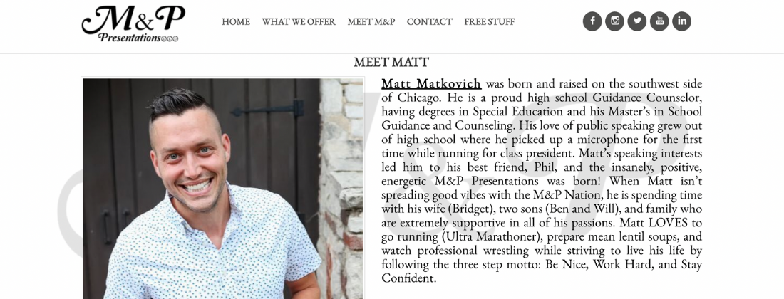
Matt Matkovich’s landing page is more personal and less commercial than many other speakers’ websites. You are immediately met with a non-speaking photo of Matt, which helps present him as just a regular guy, someone you can relate to. And next to the photo is a thorough bio that introduces Matt’s story and background, giving a sense of who he his, what he has to offer, and why he’s someone you want to know and trust. Further pages on his website can easily be found and explored from the clearly-marked tabs in the header.
Erin Pompa – Youth Speaker and Coach
What makes this website good?
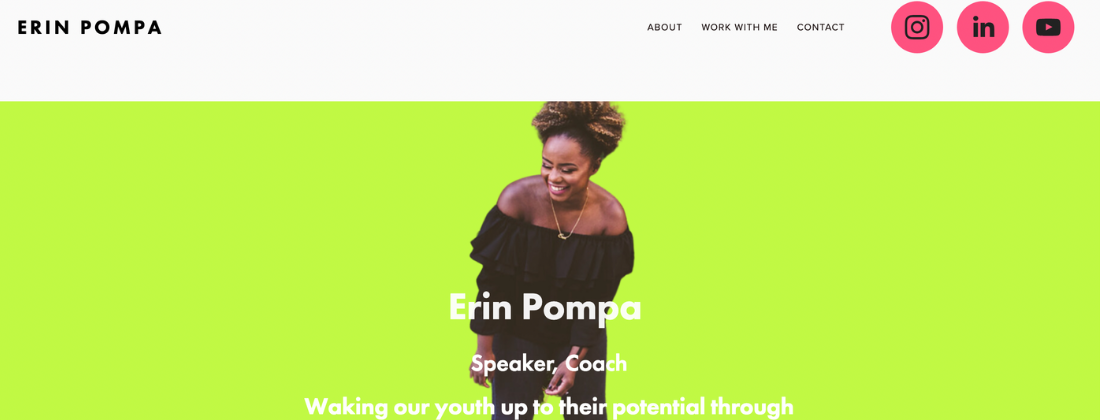
Wow, that’s a strong neon green you’ve gone with, Erin. Bright color schemes with intense contrast is a bold choice for a site design. And while it may not be recommended for a speaker’s website on dealing with trauma or something like that, Erin has nailed it on the head for her niche – youth! Young people are often bold, bright, and in-your-face, much like the color scheme and design of Erin’s site.
Now, you may be thinking, “But you pointed out earlier that it isn’t the audience members, kids in this case, who are doing the hiring!” That’s true, it probably isn’t third graders who are perusing the website looking for a speaker to hire. But the decision makers in this case are people who are intimately engaged with young people – teachers, administrators, coaches, youth group leaders, counselors, you name it – and they will understand the youthful design behind Erin’s site and how it actually communicates her brand really well.
Knowing your niche and your message is absolutely vital to knowing how best to design your public speaker website.
Phil Januszewski – Science Teacher and Leadership Coach
What makes this website good?
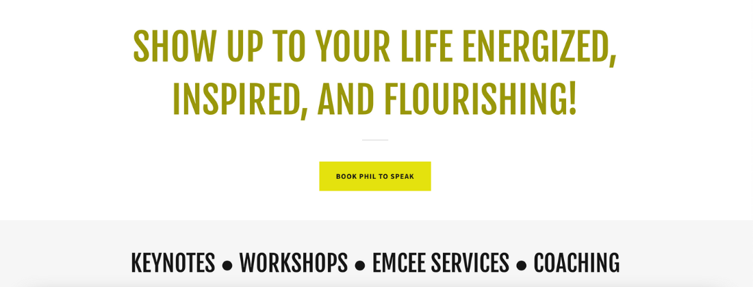
The image above is not from Phil’s home page but rather from his “Keynote Speaking” page which can be easily found via a tab in his website’s header. The tagline is bold, centered, and gives a clear indication of the type of person to whom Phil is reaching out. Below that is a button that will take interested event planners or decision makers directly to Phil’s booking email. And below that button, he has listed the four key services he offers: keynotes, workshops, emcee services, and coaching.
Not pictured above, the page also holds testimonials and outcomes of his speaking gigs which include things like “A Restored Passion and Purpose” or a “Surge in Positive Energy.” His message and brand is clear and the website is easy to follow for event planners and listeners alike.
Shep Hyken – Customer Service Keynote Speaker
What makes this website good?
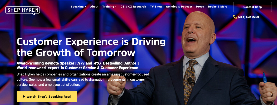
Shep’s landing page is superb. Big, engaging picture of him in his element, niche clarified (“Customer Experience is Driving the Growth of Tomorrow”) in big bold letters, accomplishments and awards listed to establish expertise, a brief brand explanation for clarity, a direct phone number to contact his team, and a link to watch his speaker reel. And all that is without having to even scroll at all!
As usual, his website is easy to work your way through using clear sections at the top of the page that include his services, his story, his media footprint and appearances, and his publications.
Michelle Onuorah – Author and Speaker on Prophetic Listening
What makes this website good?
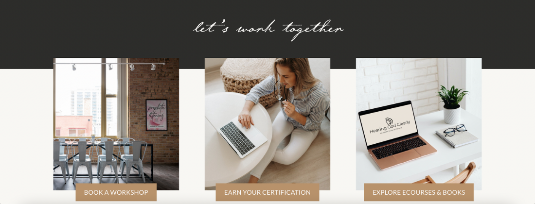
Michelle’s home page has it all. A clear description of her message is the first thing you’ll notice, next to a nice, crisp headshot of Michelle herself. The image above is found on her landing page as well and beautifully illustrates how you can share what services and products you offer in an attractive, clean way. She also lists different companies she’s worked with including Yahoo! and Medium.
Further down is her bio, followed by links to her podcast episodes. Michelle’s website is a perfect example of how easy it is to have a website that communicates everything you need to communicate to decision makers and interested listeners without allowing it to become cluttered. She uses big images and concise but clear writing throughout which allows for an easy yet informational scroll.
Simon Sinek – Author and Speaker on Business Leadership
What makes this website good?
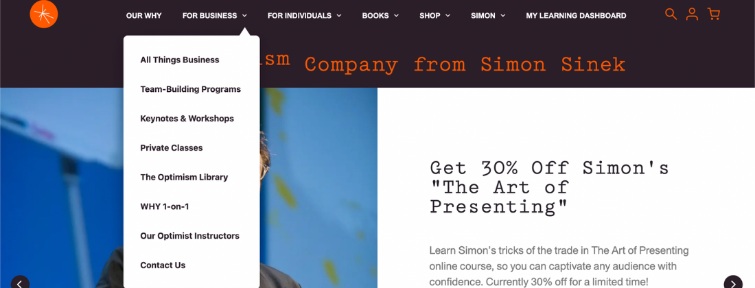
Simon Sinek’s website is likely going to have a lot going on. As a renowned public speaker, Simon has lots of resources and products and services on offer. He’s been in this game for a while. And a tricky thing about having more and more to offer is that it risks creating a cluttered, hard-to-follow site design. But Simon’s website’s design manages to avoid that problem brilliantly.
We’ve highlighted a great example of how a dropdown menu can clean up your site and give it a sleek design while still having loads of information. Other websites would try to fit as much of that info onto one page as possible, but Simon’s home page is actually pretty short. He uses his navigation bar to organize his site and lead site visitors to the right page.
Jake Thompson – Speaker, Author, and Coach on Leadership
What makes this website good?
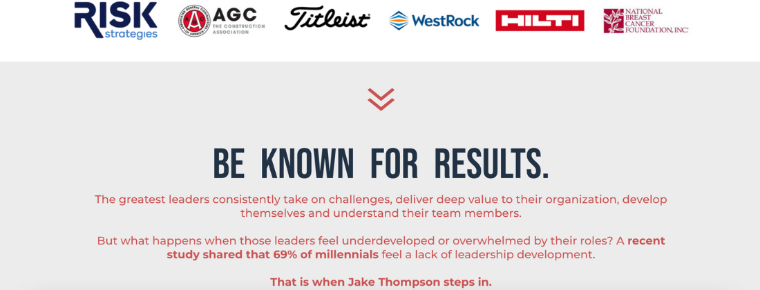
On Jake’s home page, he includes a short bio first thing to describe exactly who he is and what he does, his “why.” Behind the bio is a running clip of him on stage, doing his thing. As seen above, he also lists, using client logos, notable brands and companies he has worked with which helps establish credibility and expertise as a speaker and leader in his field.
He uses statistics (“A recent study shared that 69% of millennials feel a lack of leadership development.”) to emphasize the need for his services and expertise, which is something that decision makers are obviously looking for when they search for speakers and coaches. “That is when Jake Thompson steps in.” A phrase like that indicates that Jake knows what he’s good at, understands his worth and his impact, and has shown that over time.
Rory Vaden – Author and Speaker on Building Brands

What makes this website good?
You know what’s great about Rory’s website? There is literally no way you can see his landing page and not immediately know what he’s all about. It’s like his tagline is yelling at you – “BECOME WEALTHY AND WELL-KNOWN!” That’s an eye-catcher. And to solidify your interest Rory immediately follows that with a description of his main accomplishments and his goals for you, including being a best selling author. Links to events he is lined up to speak at and also a free training he offers are right there to keep your interest burning.
His site’s design is clean, clear-cut, and smooth, including videos of him speaking, testimonials, a brief lesson on Rory’s methodology, impacts, social media icons, and more. This site really has it all – and it still isn’t cluttered!
Jason Hewlett – Speaker, Author, Entertainer, and Impressionist
What makes this website good?
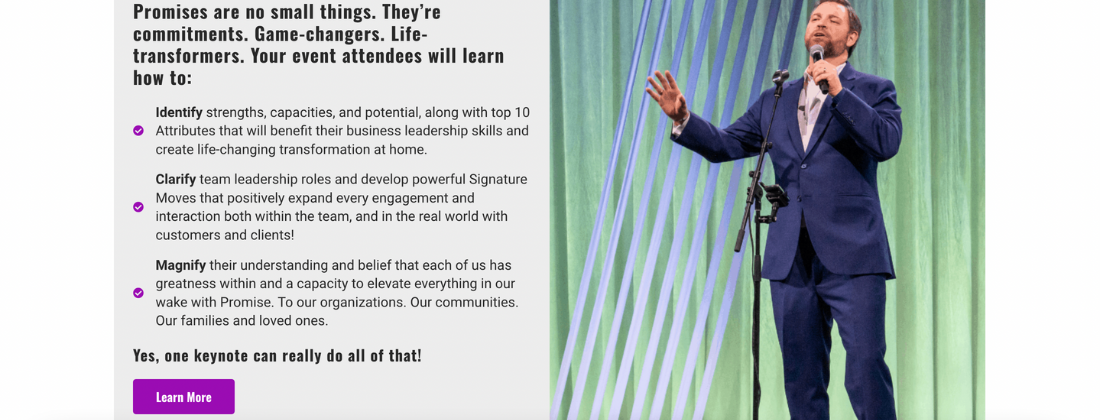
While we might feel that this section doesn’t feature soon enough on Jason’s landing page, it is an awesome example of catering your site’s messaging to the people who are actually making the big decisions. This section is clearly aimed at event planners and describes exactly what planners can expect their attendees to come away with should they hire Jason for their event. This is exactly the type of thing decision makers want to find and find quickly on a website they are exploring when looking for potential speakers. Decision makers want to get a good idea of what a speaker offers before needing to reach out personally.
Ravi Rajani – Speaker, Coach, and Consultant
What makes this website good?
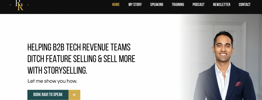
Ravi is a former TSL student and we love to see him putting our training to use in his website design! His site is organized, attractive, and no-frills. His brand of helping B2B teams sell more with using his “storyselling” methods is front and center, immediately followed by a link to book Ravi to speak at your event. His website is easy to surf using the tabs in the header.
There are links to his podcast further down the landing page as well as his service offerings which include things like keynote speaking and bootcamps. His testimonials include reviews from leading business and sales executives, adding to his credibility as a leader in the niche. While many websites’ contact forms are simply a space to enter your name and email with no explanation, Ravi’s form where you can subscribe to his newsletter includes a brief but clear explanation on exactly what readers can expect to get from it.
Molly Fletcher – Sports Agent Turned Speaker
What makes this website good?
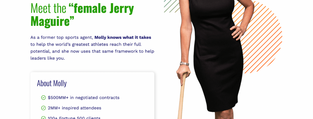
We just love this section on Molly’s home page. Nothing works like a good pop culture reference. Your mind is immediately drawn to Tom Cruise sorting out lucrative contracts for big sports stars. If Molly is like that, she must be good, right? She uses that reference to help you understand who she is and then connects that past life of hers to her speaking career now. You know what she offers as a speaker because you understand her background. The listed stats below just solidify her expertise.
If you scroll through the rest of her home page, you’ll find clear descriptions of what her brand is about, where she comes from and how she uses that to impact her audiences. Her services and free resources are listed with links. The design is simple and flows well without overwhelming the reader.
Matt Abrahams – Professor, Podcast Host, Author, and Speaker
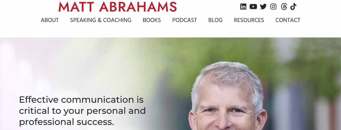
What makes this website good?
If Matt’s primary message is about effective communication, you would expect his website to communicate effectively – and it does. His brand is described first thing on his landing page, next to a welcoming headshot. The sections of his website are labeled in header tabs in big, clear font that makes you want to explore them. Often, website designs put the social media links at the very bottom of the page but Matt puts his right at the top, easy to access and follow.
Matt keeps a blog as well which is great for establishing credibility as a public speaker for his website visitors. His target audience is event planners and individuals alike so it makes sense that his own website would do a good catering to both groups. There are clearly-marked links for decision makers to follow to understand what Mark offers as a speaker and coach and how to book him, but there are also loads of useful resources and tidbits just for the interested listener, maybe a someone who enjoys his podcast or a student of his.
Dan Martell – Entrepreneur, Author, Investor, and Coach
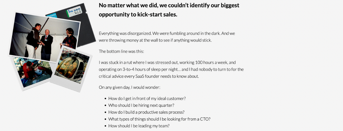
What makes this website good?
The image above is from Dan’s “About” page. He starts by renaming his brand and then proceeds to give just a simple backstory to help site visitors understand where he comes from. We included the section pictured above because we think it does a great job of helping readers relate to his experience as an entrepreneur. The list of questions he has includes questions that most entrepreneurs have probably asked at some point. It adds a personal touch. A business owner who can relate to those issues is likely to keep digging into what Dan offers. This is one the best examples of drawing in decision makers by catering to the individual.
Christine Hassler – Author, Coach, Speaker, and TV Host
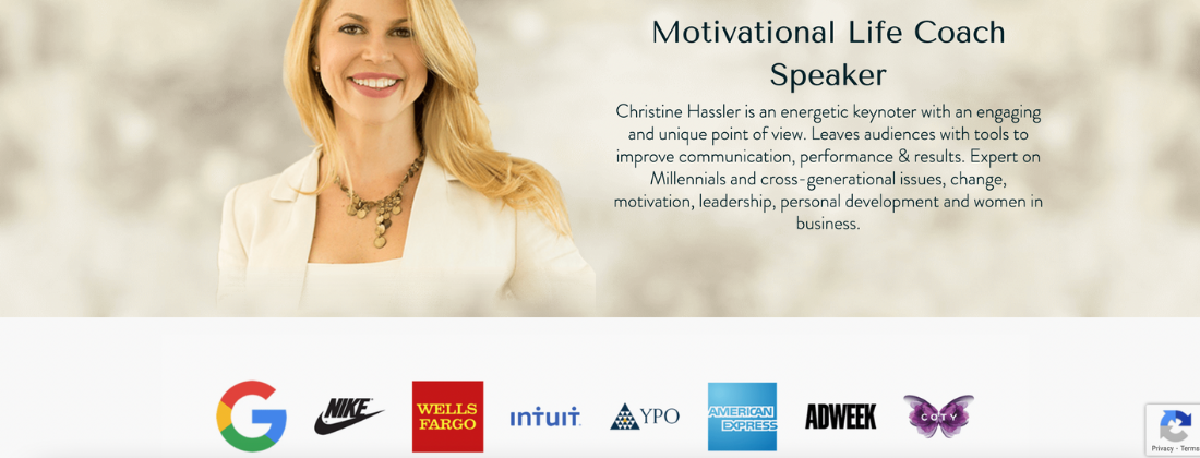
What makes this website good?
Christine Hassler’s website visitors will find this brand description on her “Speaker” page. Christine includes details on what decision makers can expect from her on stage. It also indicates what impact she, as a motivational speaker, can have on audience members, which is the primary goal for event planners. She also includes regularly updated partners that present her as an established speaker and one of the thought leaders in her niche. If brands like Google and Nike are working with Christine, surely that’s some social proof of the quality of her speaking business.
Conclusion
Creating an impactful and professional speaker website is crucial for establishing your presence in the speaking industry. Our hope is that by looking over these examples and incorporating key elements such as a compelling (and prominently-placed) demo video, clear contact information, authentic testimonials, and consistent visual branding, you can create a site that not only attracts potential clients but also conveys your unique value as a speaker.
Remember, your website is often the first impression you make on event planners and decision makers, so make it count. Like the best speaker websites, a well-crafted website will have you well on your way to securing more speaking engagements and growing your professional speaking career.
